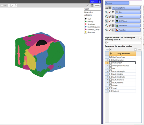
Parameter Importance
Purpose
Visualise and interrogate the contribution of parameters or categories (SHAP) that contribute to the predicted performance.
Steps
-
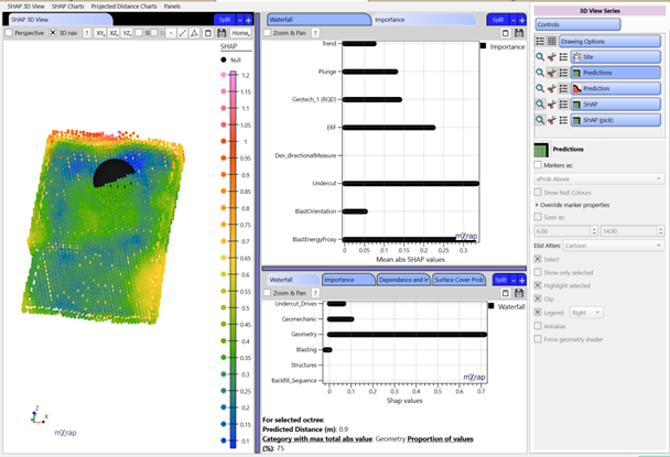
Visualise Results:
a. 3D Viewer - Visualisation of parameter importance. You can use F2 to pick a point to investigate a specific area.
- Different marker styles can be used for the SHAP series to analyse the information:
- Max SHAP category
- Max SHAP parameter
- Parameter value (for selected parameter in the control panel)
- SHAP value (for selected parameter in the control panel)
- Different marker styles can be used for the SHAP series to analyse the information:
b. Charts for parameter or category importance for specific areas picked using F2 and for the entire stope. For more information on the type of charts, see below.
What is SHAP?
It stands for SHapley Additive exPlanations and are a way to explain the output of any machine learning model. Each parameter is assigned an importance value representing its contribution to the model's predicted distance for each octree. SHAP values show how each parameter affects each final prediction, the significance of each parameter compared to others, and the model's reliance on the interaction between parameters.
What is this chart telling me?
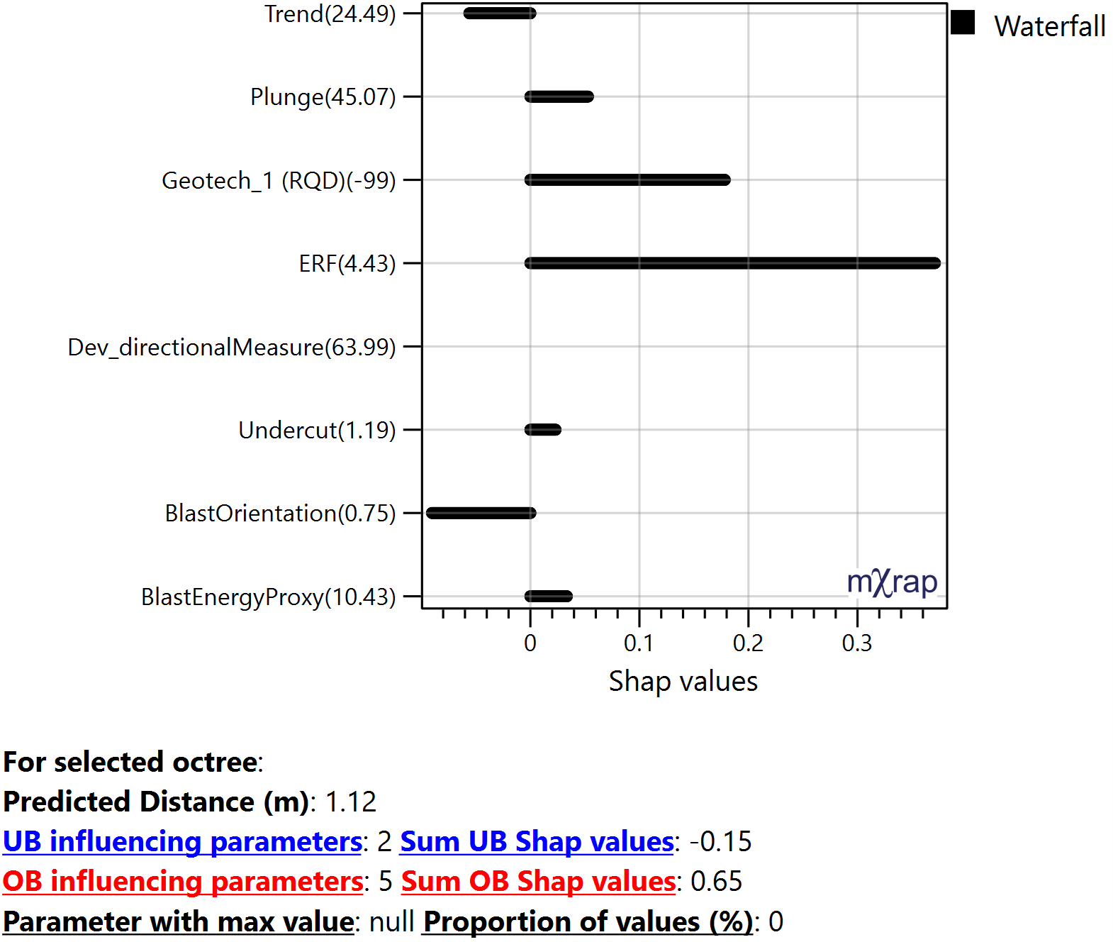
Waterfall:
Plots the SHAP value for each parameter or category for the picked octree. Can be interpreted as the amount of OB or UB it adds for that selected octree affecting the final prediction. These are approximate SHAP values but gives an idea of the magnitude of impact each parameter has at that location based on its value. The sum of the SHAP values should add up to the predicted distance.
Y-axis: The numbers represent the parameter values for the selected octree.
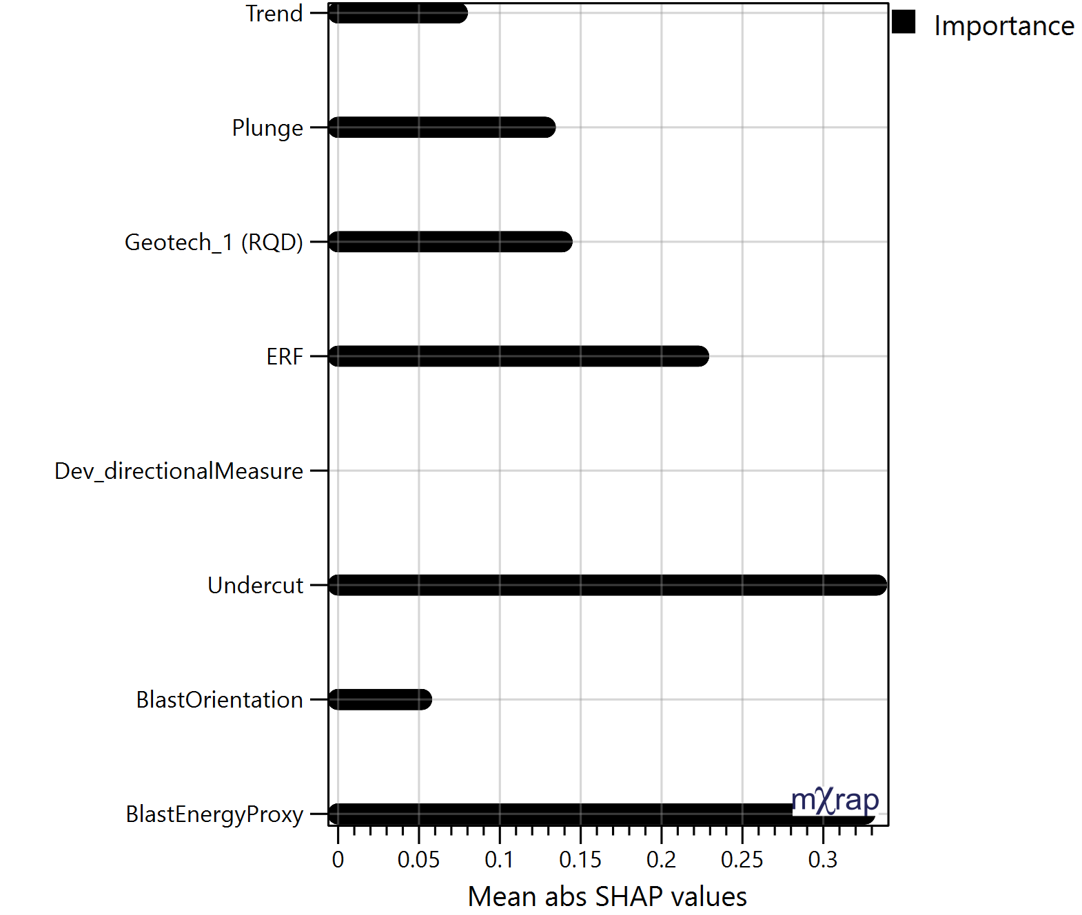
Importance:
Plots the mean absolute SHAP value of all the stope octree for each parameter or category. Allows to identify which parameter have a larger impact on the predictions. These are approximate SHAP values but gives an idea of the magnitude of impact each parameter has on the stope performance. This chart can also be plotted per face.
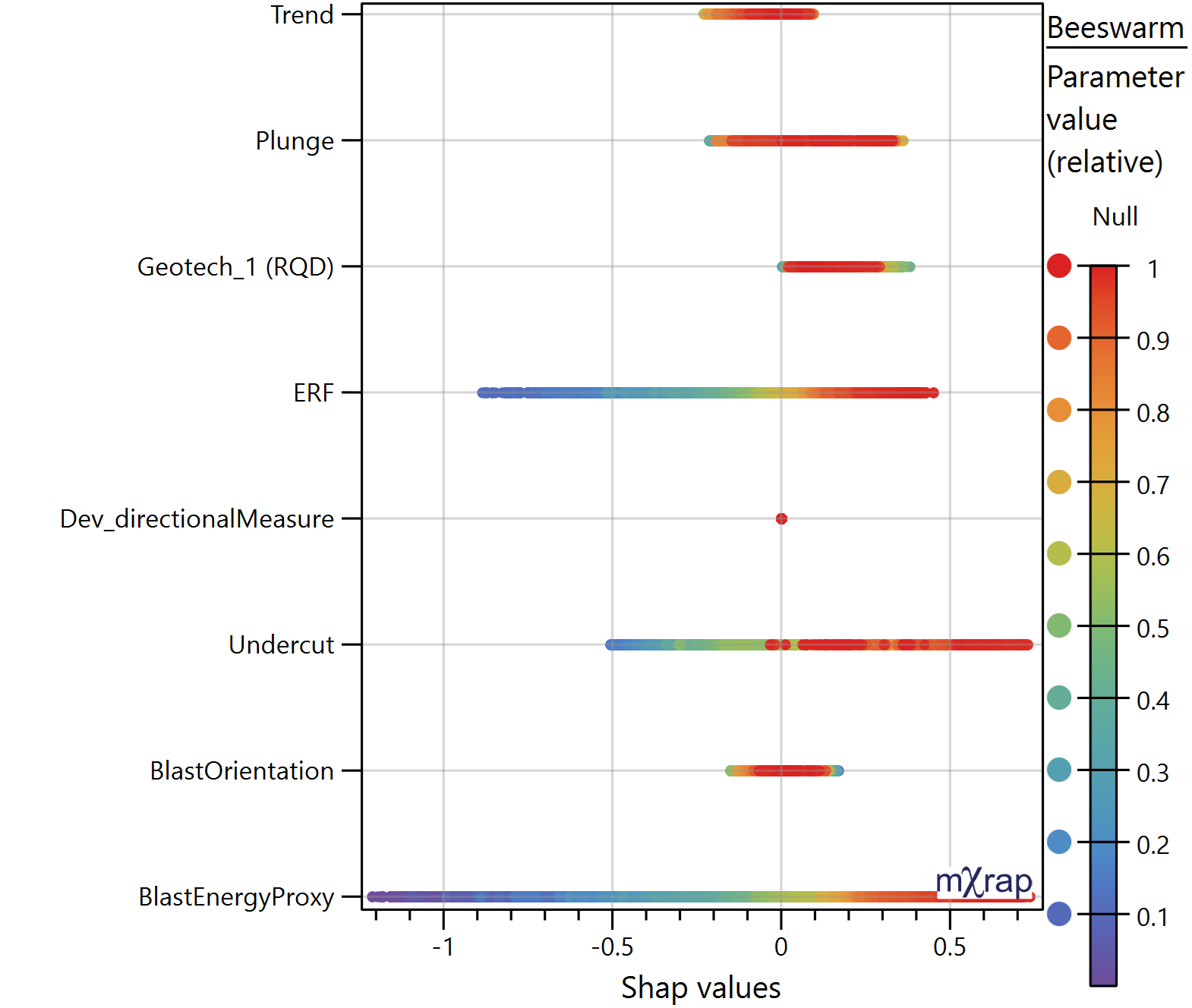
Beeswarm:
Plots the SHAP values for each parameter or category and for all the octree in the stope. The marker style represents the relative distribution of that parameter value with in that stope, meaning, red represent higher values and purple lower values. It is used to understand the correlation between the SHAP value and parameter value, observing trends. Allows to identify how the parameters affect OB and UB.
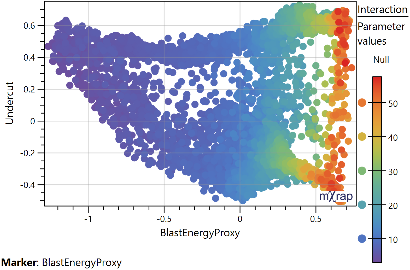
Interaction:
Plots the SHAP values for the selected parameters on the X and Y axis. SHAP can help uncover these interactions by explaining how combinations of parameters contribute to the model's predictions.
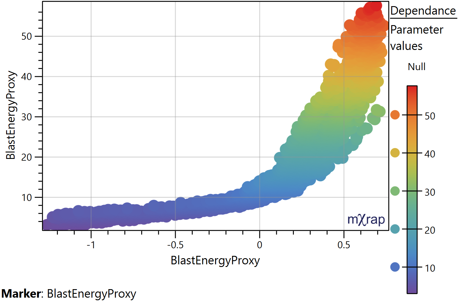
Dependence:
Plots the SHAP values for the selected parameter on the X axis. And the parameter values on the Y axis. The distribution of the points informs us whether there is a general trend between the parameter values and SHAP values and allows us to identify linear or non‐linear relationships. *Use the Z axis for the marker style which represent the parameters values.
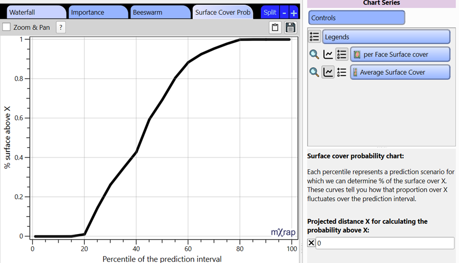
Surface cover probability:
The prediction model used outputs a standard error for each prediction, which is used to generate a prediction interval. Each percentile of that interval represents a stope performance scenario and represent the same percentile used when building the model. Since multiple scenarios can be generated, we can track the percentage of octrees with a predicted distance over a given distance and build a cumulative chart which we see here. Therefore, we can analyse how that proportion of the surface above X fluctuates over the prediction interval and indicates the likelihood of exceeding the given distance and what proportion of the stope will be affected. For the example below, it can be read as there is a 60% chance (40 percentile) that at least 40% of the stope will be overbroken.
This window doesn't have any user requirements but provides insight into what parameters causes a particular prediction. This provides a starting point when looking to refine a design.