Marker Styles
mXrap provides powerful marker style customisation options for both general users and developers.
General User Features
mXrap makes it easy to quickly customise series marker styles on the fly:
- Marker Style Overrides from series control panel:
- Adjust lightness and transparency of a series
- Change colour and image of single-point markers
- Modify colour of survey series
- Categorical legends for better data visualisation
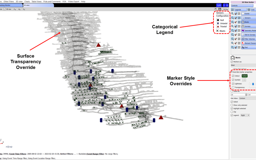
Understanding Marker Style Overrides
The marker style override system allows you to make temporary adjustments to how data is displayed without permanently modifying the underlying marker style definition. This is useful for:
- Quick visual adjustments during analysis
- Highlighting specific data ranges
- Comparing different visualisation approaches
- customising views for presentations or reports
Overrides can be applied to:
- Lightness: Make markers lighter or darker
- Transparency: Adjust opacity to see through overlapping data
- Colour: Change the colour of single-point markers or survey series
- Image: Swap marker symbols for different visual representations
These overrides are saved with workspaces, allowing you to maintain different visualisation configurations for different analysis tasks.
Creating Custom Marker Styles
Four Types of Marker Styles
When creating a new marker style, you can choose from four types:
- Single Marker: No variation based on input parameter (e.g., blast markers are always a red smudge star)
- Range of Markers and Colours: Varies based on input value (most common type)
- Categorical Markers: Different markers for different categories
- Custom Markers: Advanced customisation options
Step-by-Step: Creating a New Marker Style
To create a custom marker style (e.g., for Corner Frequency):
- Open the Settings Window: Go to Windows → Settings window
- Create New Marker Style: Click New → Make a new marker style (pink/purple interface options)
- Save: Save to an appropriate location (e.g., Site Setup folder)
- Configure Basic Settings:
- Choose marker type (e.g., "Range of markers and colours")
- Set a short label for the legend (e.g., "f0" for Corner Frequency)
- Point to the input data source (table and column)
- Set Input Parameters:
- Select if input is logarithmic
- Specify minimum and maximum values for consistency
- Configure alpha input for transparency (optional)
- Configure Range Tab:
- Specify colours using colour ramps or discrete levels
- Set start and end colours for linear ramps
- Choose symbols (e.g., 64x64 sphere)
- Add multiple rows for specific level ranges if needed
- Save the Marker Style: Click Save at the bottom
Adding Marker Styles to General Analysis
To make your custom marker style available in General Analysis:
- Open Settings Window: Navigate to Interface → Site Specific Tools
- Find Site Event Markers: This menu definition controls which markers appear in General Analysis
- Add New Tool: Right-click → Add New Tool → Add New Marker Style
- Link to Your Marker Style: Browse to the marker style you created
- Give it a Name: Provide a display name (e.g., "Corner Frequency")
- Save: The marker style will now appear in General Analysis under the Site marker styles
Your custom marker style will be available in 3D views, charts, and tables throughout General Analysis.
Customising Event Magnitude Markers
The default event local magnitude marker might not suit your site's needs. A might have different significance at different operations.
Common Event Magnitude Marker Styles
There are seven default magnitude marker styles that can be customised:
- Spheres: The most common marker style, used in most 3D views
- Shapes: Alternative shapes for different visualisation needs
- Spheres Re-entry: Used in the Short-term Response app
- Dash: Uses dash symbols, typically for diurnal charts
- Smooth Grading: Linear transitions between all magnitude levels
- Scales: Additional scale variations
- Other variations: Specialised uses in different apps
How to customise Magnitude Markers
- Open General Setup App: Navigate to Windows → Advanced window (at bottom of list)
- Select Marker Style: Choose from the magnitude marker styles in the menu (e.g., Magnitude Spheres)
- Go to Ranges Tab: This defines colours for event spheres in 3D views, charts, and tables
- Modify Colour Ranges:
- The "Up to" column defines magnitude thresholds
- Each row specifies a colour for that magnitude range
- You can use colour ramps for smooth transitions between colours
- Double-click colours to open the colour picker
- Colour Specification Options:
- RGB (Red, Green, Blue) values
- HSL (Hue, Saturation, Lightness) values
- Colour wheel selection
- Preset colours
- Add or Remove Rows:
- Add rows for more specific magnitude levels
- Delete rows to simplify the scale
- Set Transparency: Specify transparency per layer (0-100)
- Save Override: Use Actions → Save (NOT the Save button at bottom of window)
- This creates an override file that takes precedence over the default
- You can Load to revert to previous saved changes
- Repeat for Consistency: Apply the same colour scheme to all seven magnitude marker styles for consistency across apps
When customising magnitude markers, update all seven magnitude marker styles to maintain consistency across different views and applications.
Advanced Marker Style Features
Colour Ramp Options
Marker styles support various colour ramp configurations:
- Linear Colour Ramp: Smooth transition between start and end colours across the value range
- No Ramp: Discrete colour levels with sharp transitions between ranges
- Custom Ramps: Define multiple colour ramp segments for different value ranges
You can combine ramp types within a single marker style. For example, use a linear ramp from blue to orange for one range, then switch to no ramp with solid red for values above a threshold.
Transparency Controls
Transparency can be configured at multiple levels:
- Per-layer transparency: Set transparency values (0-100) for each colour range
- Start and end transparency: Define transparency gradients across marker style ranges
- Alpha input: Link transparency to a data parameter for dynamic transparency based on values
Transparency is particularly useful for:
- Highlighting specific value ranges while de-emphasising others
- Viewing overlapping data in 3D views
- Creating clearer visualisations of grid-based analysis results
Isosurface Marker Styles
Marker styles behave differently for isosurfaces compared to point data:
- The first colour level is typically ignored (no isosurface rendered)
- Isosurfaces appear at transitions between colour levels
- 100% transparency creates gaps between isosurfaces
- Multiple isosurface levels can be defined with different colours
For example, in a B-value marker style:
- 0.9 (white) - ignored, no isosurface
- 0.99-1.0 - red isosurface appears at this transition
- 1.0-1.2 with 100% transparency - gap, no visible isosurface
- 1.3 - another isosurface level
This allows precise control over which hazard or analysis levels are visualised in 3D.
Colour Specification Methods
Colours can be specified using multiple methods:
- RGB (Red, Green, Blue): Standard colour model with values 0-255 for each channel
- HSL (Hue, Saturation, Lightness): Alternative colour model for more intuitive colour selection
- Colour Wheel: Visual selection tool for picking colours
- Preset Colours: Quick access to common colours
- RGB Paste: Paste colour values in the format
RGB(100,200,220)directly into marker style tables
Logarithmic Input
For parameters that span multiple orders of magnitude:
- Enable "Input is logarithmic" option
- Ensures even distribution of colours across the logarithmic scale
- Particularly useful for parameters like corner frequency, seismic moment, or energy
Developer Features
mXrap offers advanced tools and features to create marker styles with improved contrast:
Threshold and Range Controls
- Specify threshold values as percentages of min-max range for more generic colour schemes
- Define diverging spectrums around chosen mid-points
- Use IDs as marker colour inputs
- Set start and end transparency for marker style ranges
Colour Management
- Interpolate through various colour spaces including CIELAB and CIELCH
- Access colour scheme presets with well-designed ramps for cyclic or diverging data
- Use test images to evaluate perceptibility and simulate colour vision deficiencies
Colour Scheme Resources
For more information on effective colour schemes:
Integration with Charts and Workspaces
Marker Styles in Charts
Marker styles are extensively used in charts throughout mXrap:
- Point markers: Display individual data points with colours and symbols based on marker style definitions
- Hover information: When enabled, hovering over points shows the marker colour input values (e.g., seismic moment when using coloured markers)
- Legends: Categorical legends provide clear interpretation of marker style colour scales
- Consistency: The same marker styles used in 3D views appear in charts, ensuring consistent visualisation
Charts support all marker style features including:
- Colour ramps and discrete colour levels
- Transparency controls
- Custom symbols and sizes
- Logarithmic and linear scaling
Marker Styles in Workspaces
Workspaces save your complete marker style configuration:
- Series configurations: Marker styles, colours, sizes, and visibility settings
- Override settings: Any temporary adjustments to lightness, transparency, or colours
- Custom marker styles: References to site-specific marker styles you've created
- Consistency across sessions: Load a workspace to restore exact marker style settings
This makes workspaces ideal for:
- Maintaining standard visualisation configurations for routine analyses
- Sharing analysis setups with colleagues
- Creating presentation-ready views with customised marker styles
- Documenting analysis approaches with specific marker style configurations
Specific Marker Style Types and Applications
Marker styles are used throughout mXrap applications to visualise different types of data and analysis results.
Hazard Assessment Marker Styles
The Hazard Assessment app uses specialised marker styles to visualise seismic hazard in different ways:
P [ML within R]
The P [ML within R] marker style shows the probability of exceeding the design magnitude within the design distance (R) of the minode location (per year). This is the simplest minode hazard estimate.
Ground Motion Hazard Marker Styles
Other marker styles express hazard based on probabilistic strong ground motion (PPV'):
-
Equi-probability zones: A simple ranking of minodes from lowest to highest P[PPV']. The marker style value is a percentile rather than a probability. For example, with 100 minodes, the top 5 with highest hazard will be red (0.95-1.00), the next 5 highest would be orange (0.9-0.95), etc.
-
Cumulative P[PPV]: Ranks minodes from lowest to highest P[PPV'] but the marker values are probabilities accumulated from lowest to highest. Shows both the cold-to-hot scale and an indication of absolute hazard.
-
Probability Class: Similar to Cumulative P[PPV] but allows you to specify your own colour scale and classes with custom names to help communicate changing hazard areas to operational personnel.
Moment Tensor Marker Styles
The Principal Axes Density Plot uses marker styles that depend on the visualisation method:
Kernel-Splattered Marker Styles
-
Kernel-Splattered Count: Colours indicate event density based on splattered event counts. The density estimate values change based on the number of events being splattered, but remain stable regardless of icosphere grid density, kernel function, and maximum splatter distance.
-
Kernel-Splattered Equi-probability Zones: Areas of the same colour contain the same number of (splattered) events. The darkest colour (0.9 to 1.0) has the same number of splattered events as other coloured regions, but covers the least area (highest event density). The lightest colour (0 to 0.1) has the lowest event density.
Short-term Response Marker Styles
The Short-term Response Analysis app uses marker styles in the Triggers 3D view to assess the location of triggers that typically have a response. Marker style colours and scales help identify which blasts or events warrant exclusion or evacuation procedures.
RMDA Marker Styles
The Rock Mass Data Analyser (RMDA) application includes various marker styles for geotechnical data:
- Structure type marker styles for structural data
- Failure type marker styles for intact rock strength data
- Marker styles for rock mass quality, stress data, and borehole observations
Stope Wizard Marker Styles
In the Stope Wizard's Face Detection window:
- Vector Average marker style: Used to visualise the tolerance angle when grouping octree blocks into faces with similar geometry
- Element Count marker style: Shows the number of blocks in each face, useful for determining minimum block requirements
Use Cases and Examples
Example 1: Site-Specific Magnitude Thresholds
Scenario: Your mine considers ML+1.0 events significant, but the default marker style treats them as minor events.
Solution:
- Open General Setup → Advanced window
- Select "Magnitude Spheres" marker style
- Adjust the colour ranges so ML+1.0 events appear in orange or red
- For example, change "Up to 1.0" to orange instead of yellow
- Save the override
- Repeat for all seven magnitude marker styles
Result: Events at your site's threshold magnitude are now visually prominent across all views and applications.
Example 2: Creating a Corner Frequency Marker Style
Scenario: You want to visualise corner frequency to identify events with unusual source characteristics.
Solution:
- Create a new marker style in Settings window
- Set input to S-Wave Corner Frequency (logarithmic)
- Set range from 2 Hz (blue) to 2000 Hz (red)
- Use a linear colour ramp for smooth transitions
- Add to General Analysis via Site Event Markers menu
Result: Events with low corner frequency (large source radius) appear red, while high corner frequency (small source radius) events appear blue, helping identify unusual seismic sources.
Example 3: Hazard Communication with Probability Classes
Scenario: You need to communicate changing hazard areas to operational personnel in simple terms.
Solution:
- Use the Probability Class marker style in Hazard Assessment
- Define custom colour classes: "Low Risk" (green), "Moderate Risk" (yellow), "High Risk" (orange), "Extreme Risk" (red)
- Set probability thresholds that match your site's risk tolerance
- Display in 3D views with clear labels
Result: Non-technical personnel can quickly understand hazard levels without interpreting complex probability values.
Example 4: Highlighting High-Stress Events
Scenario: You want to emphasize high apparent stress events while still showing all seismicity.
Solution:
- Use marker style overrides in the series control panel
- Adjust transparency to make low-stress events semi-transparent
- Keep high-stress events fully opaque
- Alternatively, adjust lightness to darken high-stress events
Result: High-stress events stand out visually while maintaining context of all seismic activity.
Example 5: Grid-Based Analysis Visualisation
Scenario: You want to show multiple hazard isosurfaces at different threshold levels.
Solution:
- customise the B-value or ML Rating marker style
- Define specific isosurface levels (e.g., 0.9, 1.0, 1.2, 1.5)
- Use 100% transparency for gaps between critical levels
- Assign distinct colours to each important threshold
Result: Clear 3D visualisation showing nested hazard zones at operationally relevant thresholds.