Short-term response analysis
There are multiple features to analyse the short-term response to different triggers (events or blasts) in time and space. In later versions, this app will replace all of the tools in the previous 'Omori Analysis Tools' app but version 1 currently only replaces the old 'response to blasting' window. There are two main aspects of the app, the simple response viewer and trigger assessment windows.
Simple response viewer
This window is for the assessment of short-term responses. Triggers must be selected (ticked) from the list and response events for the selected triggers can be assessed with a number of tools.
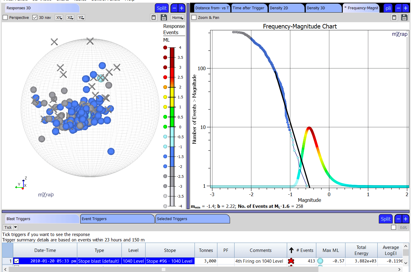
- Responses 3D -- View the trigger locations and response events within range. Adjust the spheroid controls to include/exclude events related to the trigger. 'Nearby events' are events just outside the spatial or temporal range of the trigger.
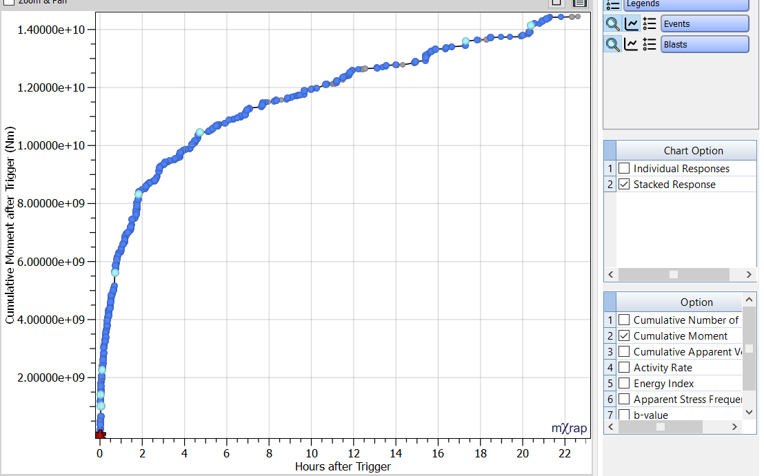
- Time after Trigger -- Chart the events as a function of time after trigger. Can plot events as a histogram or cumulatively. The time bin used for the histogram can be adjusted. When multiple triggers have been selected, can either view responses individually or stacked together. The best fit Modified Omori Law (MOL) is calculated automatically, if the calculation fails a message will appear in the control panel. You can override the MOL parameters (p, K and c) in the control panel.
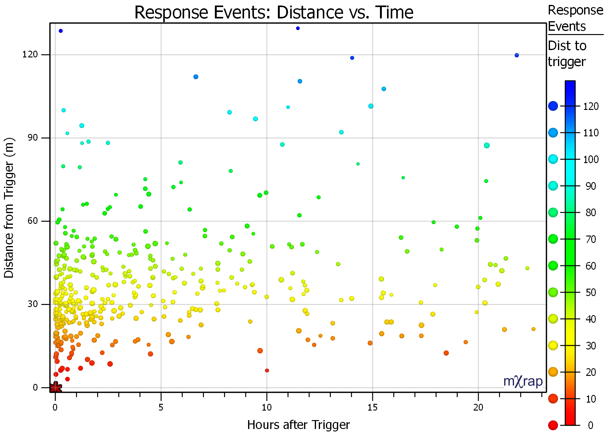
- Distance from Trigger -- Chart the events as a function of distance to trigger. Options for X distance, Y distance, Z distance, Horizontal distance and 3D distance. You can normalise the chart by the number of events or by the volume under consideration. Normalisation by number of events changes the Y axis to a percentage of events from 0-100%. Normalisation by volume changes the X axis so that the volume increases linearly as the distance increases (expanding sphere). If the cumulative events is linear for the chart normalised by volume, this represents a constant event density.
- Density 2D -- View the distribution of events in the 2D plane (XY, XZ or YZ). Events are divided into spatial bins and then ranked from highest to lowest density. The grid points are coloured by cumulative events, where the accumulation is from highest to lowest density points.
- Density 3D -- Similar to the Density 2D plot, uses the same grid spacing controls. Isosurfaces are used to show the cumulative events distribution in 3D.
Trigger Assessment Window
This window is for the analysis of triggers; either blasts, events or user defined points in space and time. If the response viewer is to assess the area of exclusion and time of re-entry, the trigger assessment window is to assess which blasts should have an exclusion and which events should have an evacuation.
- Triggers 3D -- View triggers in 3D and use the marker style colours and scales to assess the location of triggers that typically have a response.
- Trigger Summary Tables -- These tables summarise triggers by various characteristics. For example, you can use these tables to assess what type of blasts have the biggest response, what magnitude events typically have aftershocks, how the responses to triggers vary by depth etc. The tables currently use the following parameters to assess potential triggers for exclusion or evacuation:
- Blast tonnes
- Blast type
- Trigger date
- Trigger elevation
- Event magnitude
- Location (VSA)
There have been a number of recent updates to the Short-term Response Analysis app. These include:
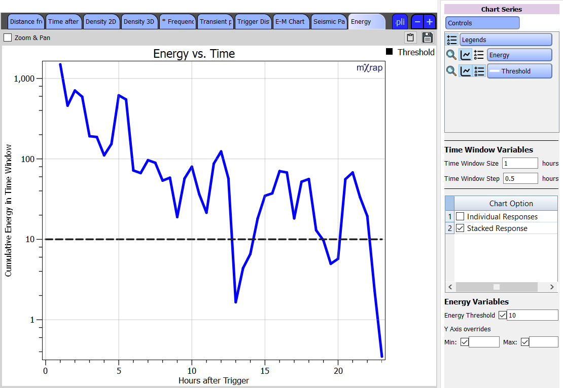
- Chart for determining re-entry using different parameters: This chart gives you values for a particular parameter over time (based on a user-defined time window size and step). A threshold value for that parameter can be set, allowing you to see when the seismic data drops below that threshold. The parameter investigated can currently be set to energy, event count, hazard, background ratio and activity rate probability. For more information about these parameters, see Tierney et al. 2019.
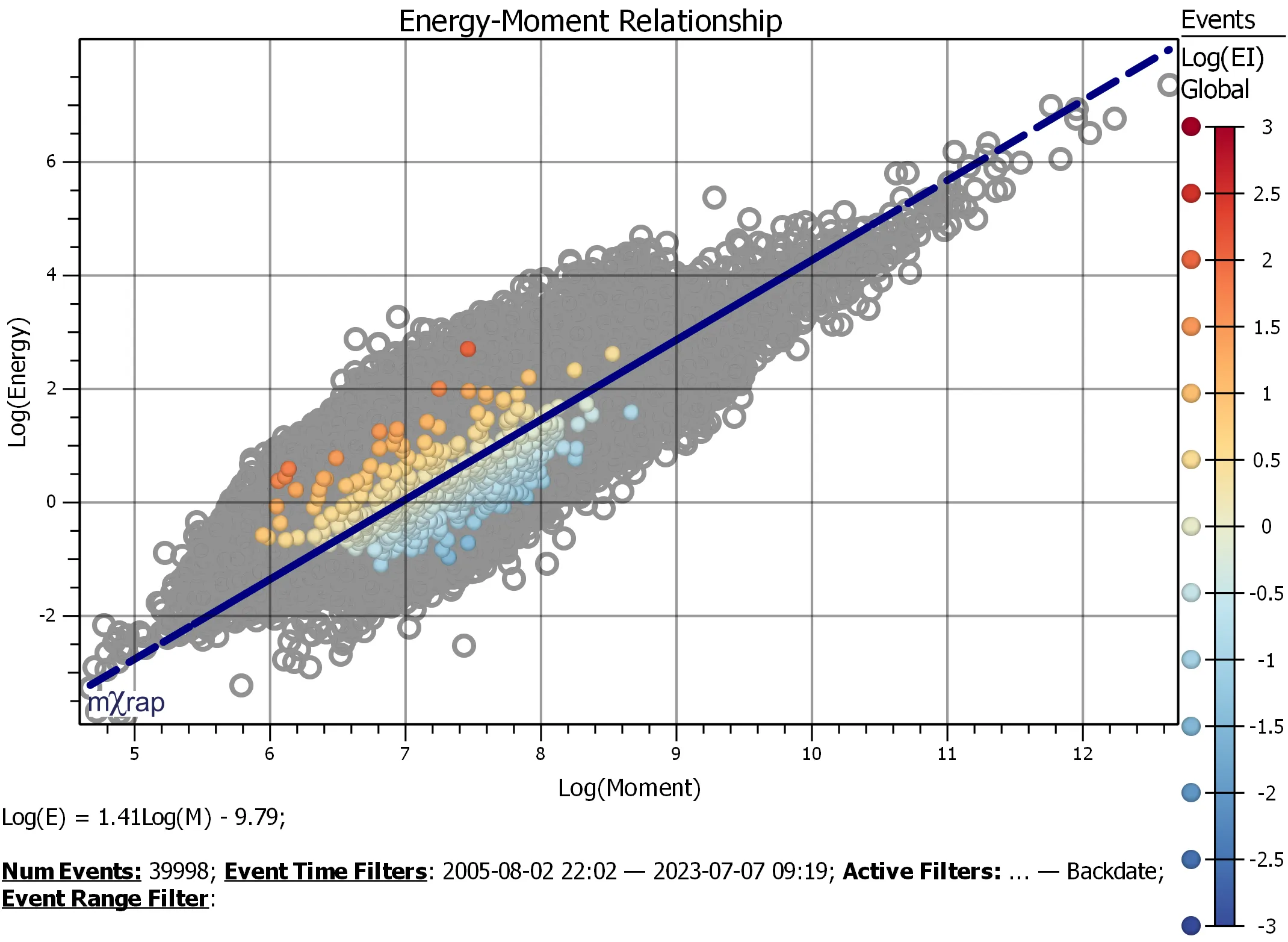
- Frequency-magnitude and log energy-log moment charts for response events: This allows you to do more detailed analysis of responses, to try to understand the underlying mechanism of the response and the distribution of events.
- Time versus distance to trigger chart: This allows you to investigate whether there are trends in your response seismicity dependent on the distance from the trigger.
- Trigger distributions chart: This is for allowing you to analyse the distribution of selected triggers, to help you make better decisions as to what criteria to use for re-entry and at what level that criteria should be set
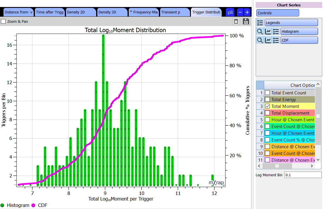
- Charts for analysing cumulative distributions of parameters: This is for allowing you to see the full distribution of seismic event parameters for a trigger (or multiple selected triggers). The parameter investigated can currently be set to cumulative number of events, cumulative moment, cumulative apparent volume, activity rate, energy index, apparent stress frequency and b-value.